pleb urban winery
Logo Design
Asheville Urban Winery
There is something really special about meeting with a client and hearing all about their goals and dreams for a new business and then watching it actually come to life. pleb urban winery opened in the River Arts District in 2018 and has become a loved Asheville establishment.
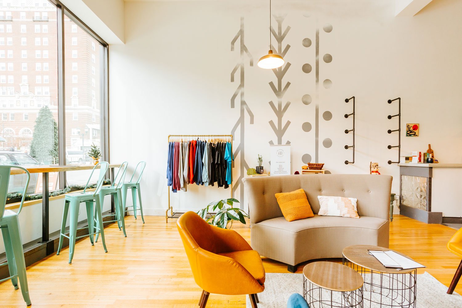
This is not your typical winery. The space is covered with murals inside and out by local artists, wine is served in taps and kegs, and the wine is made with grapes from North Carolina and the east coast.
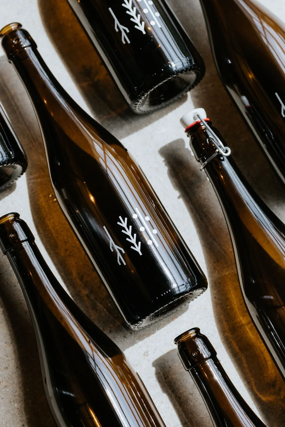
So why pleb? This winery is inspired by the Roman plebeian community that established the Aventine Triad and the symbols within the logo represent Roots (Agriculture), Growth (Fertility), and Harvest (Viticulture). The plebs weren't the wealthy landowners, they were the working class farmers, bakers and craftsmen that worked hard to support their families and were the backbone of the economy. Your typical vineyard experience is very classy and elegant, but pleb seeks to provide wine for the common folk and honor the plebeian spirit by sourcing fruit from local growers, exploring methods of fermentation and wine production, providing a welcoming environment for exploration and education, and expanding the scope of North Carolina wine. They want their company to represent a community of people who support each other and share in each other’s successes.
Follow along with their journey on Instagram: @plebavl and visit their website here.


